case study
This project primarily involved Jennie McGuirk (creative director) and I (graphic designer, prototyper). We also had help from our freelance photographer.
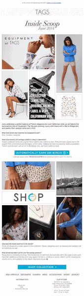
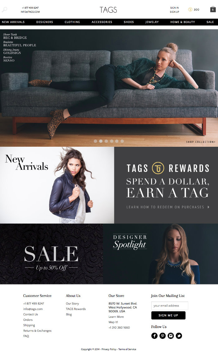
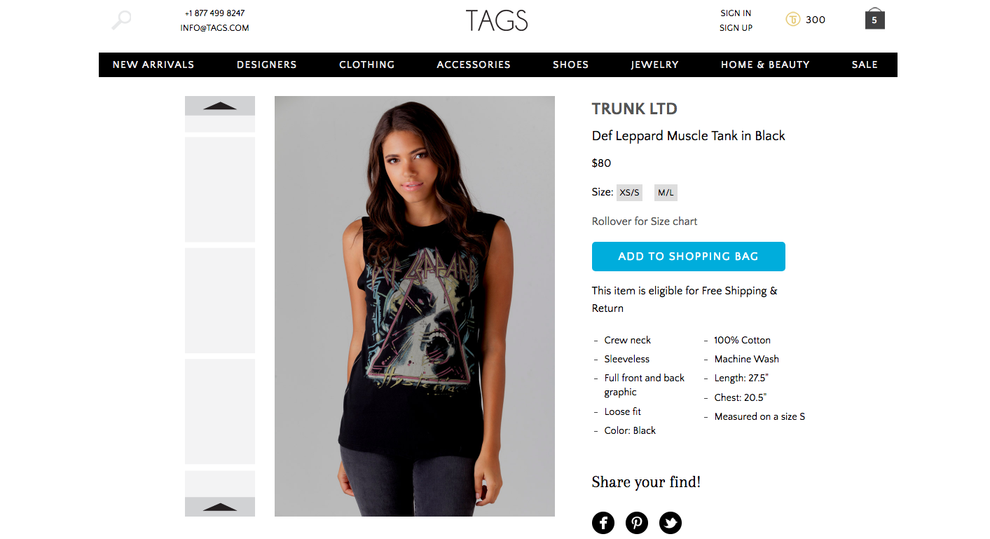
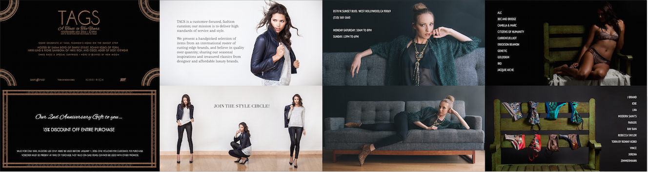
The spark began when I met the corporate creative director, Jennie McGuirk. She wanted to send out a monthly newsletter to TAGS’ customers around what made our boutique different. TAGS stocked fun and luxurious garments from around the world– from Australian swimwear, Belgian sweaters, French silk blouses– but little was done online to highlight these finds and their brands.
So every month, we highlighted a different designer with a Q&A and some curated photos. We began having more and more ideas, but any ideas that required more than minimal effort were swept aside by management. There was no real branding or style guide, our models were inconsistent, and the website needed some tightening up and a refresh.
Then came a blessing in disguise when our store owner said she wanted better product photography and would hire our freelance photographer to take the shots. Instead of feeling burned by the critique, we seized the opportunity. By creating a branding and style guide and working closely with the photographer, we convinced them to increase the budget for photography and models. As we saved time by producing a system with the guide, we were able to once again deliver a design to convince our overly-stretched developer to revamp the website by identifying optimal changes.
Note: The website, and even its logo, has changed since my time at TAGS. Thus, if you were to visit the website now, it will resemble neither the description nor the visuals described in this case study.
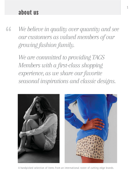
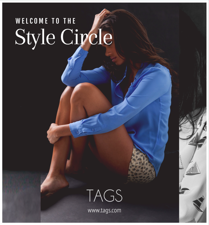
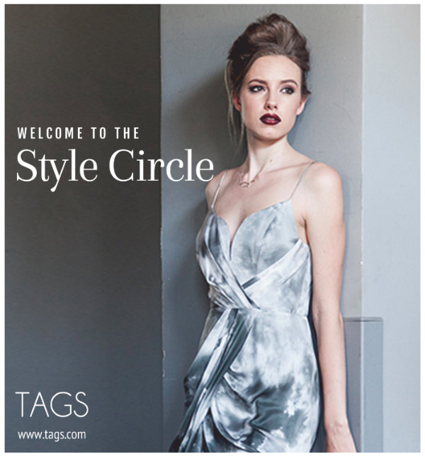
We had to define what we wanted our brand to exude. We knew the fabrics and designs were excellent, but we weren’t necessarily seeing that through campaigns and the website. So we identified the adjectives that would best describe our brand and then rewrote our mission statement.
Once this was in place, we began to play with fonts, colors, photos, and designs to capture our brand. Through competitive analysis and moodboarding, we found our mix.
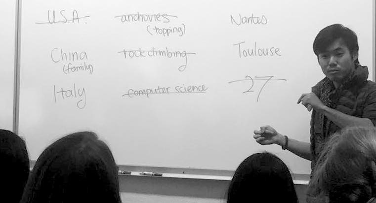
At the next photoshoot, we made sure to book one of our most promising models to bring our branding guide to life.
With the guide made, with comparison visuals from rivals, we created a deck to convince our bosses to raise the budget. We were nervous, but believed in the work we came with, ready to defend it.
We succeeded!
The best part? With better models and more time with our photographer, email campaigns were made faster as our simple design let the clothing speak for itself while maintaining cohesion with all our digital imagery.
This also meant more time to see how else we could improve the experience.
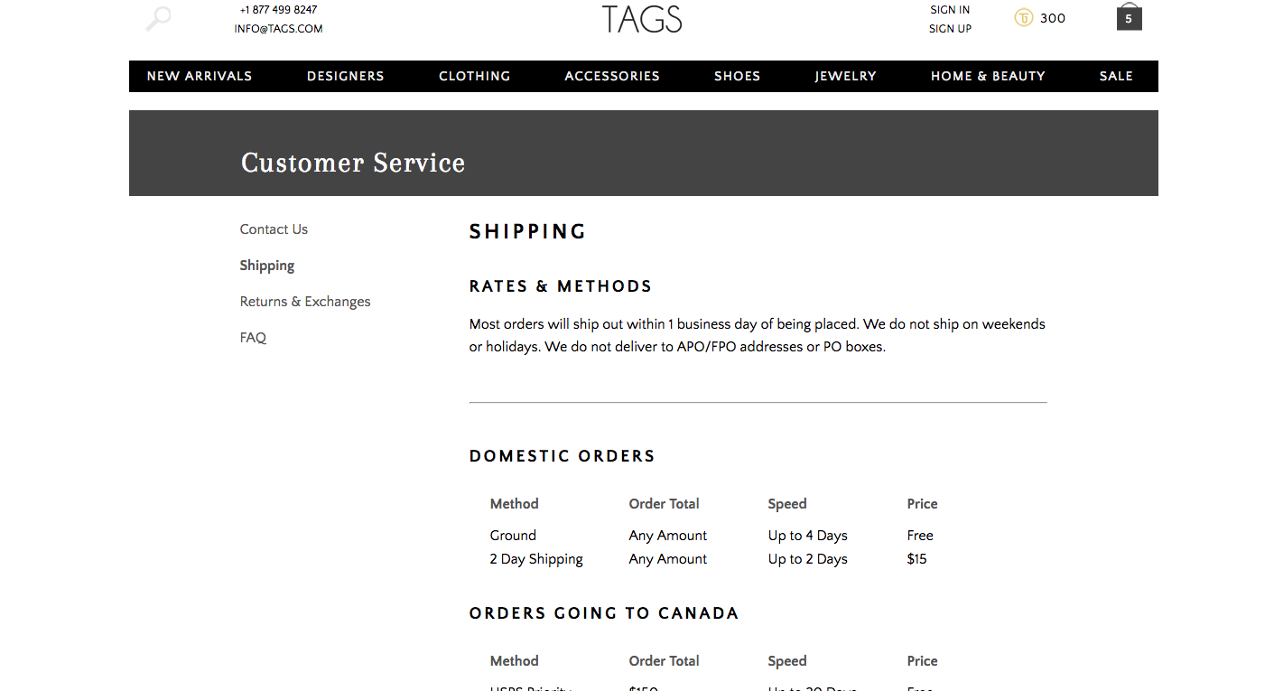
We were nervous, but believed in the work we came with, ready to defend it.To begin with revamping the website, we compiled a content inventory of each single piece of unique content on the website. By doing so, we were able to spot inconsistencies, redundancies, and other areas of improvement.
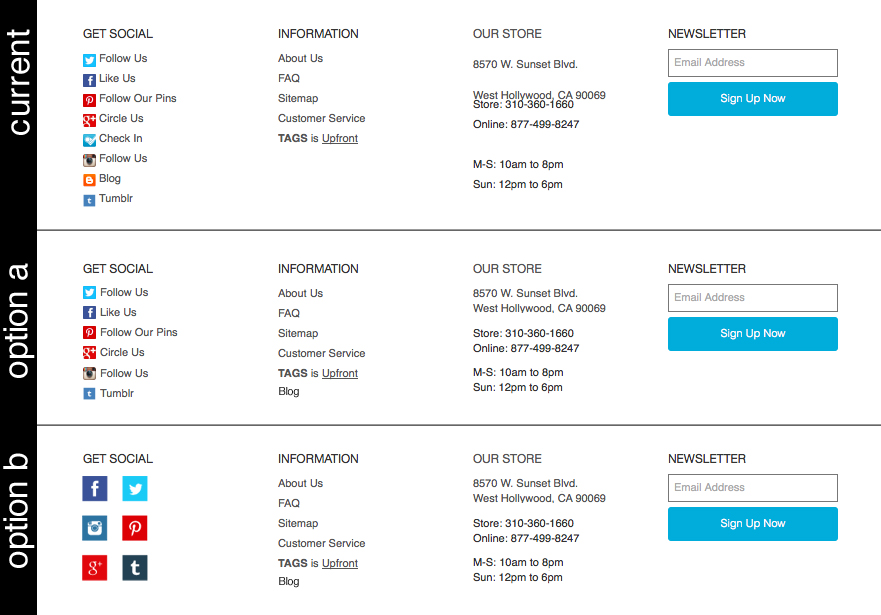
Some were banal, such as making adjusting white space to follow a user's natural grouping of information (Gestalt). For example, the address was separated with a large line break, whereas the phone number was flush underneath the second line. Others were slimming down the help page that resembled a terms of agreement with 10% scannability, adding a jump-to shortcut for the 15-screen brands page on mobile, as well as adding more visual entry points on our landing page.
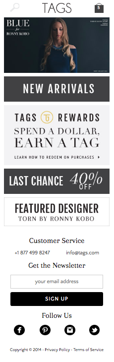
While compiling the content inventory, we made sure to check out the website in both mobile as well as desktop, as mobile was beginning to skyrocket in the e-commerce world (2014). We paid particular attention to the landing page as well as the process from browsing to purchase confirmation.
As the mobile website was mostly the desktop website squished onto a smaller screen, a lot could be done to improve tapability, scannability, and the overall mobile screen experience.
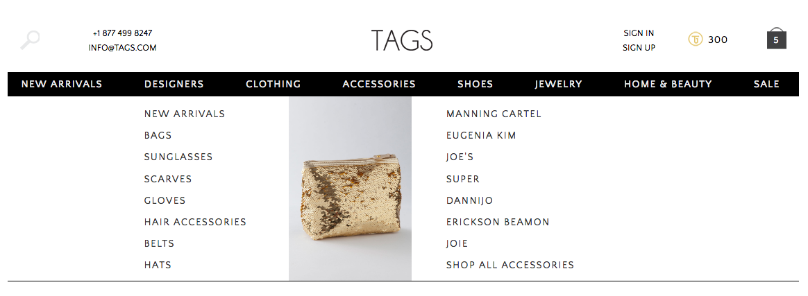
For the desktop website, we were able to learn from others through competitive analysis. With so many possible ways to classify a product and thus provide entry points, we decided to use the increasingly popular (and thus understandable) mega dropdown menus.
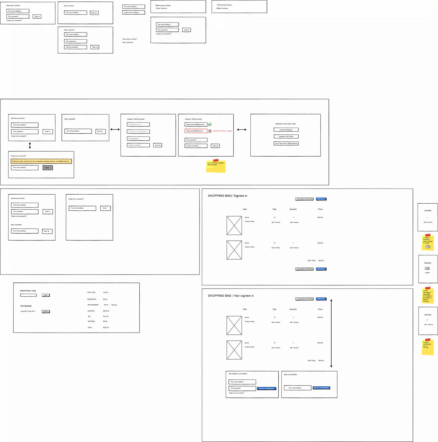
To help us get our ideas out quickly, as well as adjust them with little effort, we used Basalmiq.
After deciding on the structure through Basalmiq wireframes, I began to mock them up in Adobe Illustrator. This was especially helpful when we were unsure which of two different solutions were better. Also, this would be useful for the developer in order to highlight changes in the website, as our optimal changes, chosen to not require too much work from the developer, might have been overlooked.
Typography and Layout fo" alt="Ideation in Wireframes">
I hope you had fun reading this case study!
Copyright © 2018 - Irvin Fong